ANIMATIONS
WITH CSS
WHY ANIMATIONS MATTER
Getting things to move is easy
Planning HOW they should move is hard
BUT
LETS START ANIMATING
BUT FIRST...
We need something to trigger our animations
Pseudoclasses
commonly used triggers
:hover
div:hover {
   background: purple;
}
Trigger by a user mousing over
:focus
input:focus {
  color: red;
}
Triggers when an element "receives focus"
:active
button:active {
  color: green;
}
Triggers when an element is "being activated by user"
Passive Voice 😱
LET'S BUILD A BUTTON!
ONE MORE THING
CSS TRANSFORMS
TRANSFORM
"lets you manipulate the coordinate space of the CSS visual formatting model"
"lets you move, warp, rotate, and scale elements"
none | <transform-list>
where
<transform-list> = <transform-function>+
where
<transform-function> = [ <matrix()> || <translate()> || <translateX()> || <translateY()> || <scale()> || <scaleX()> || <scaleY()> || <rotate()> || <skew()> || <skewX()> || <skewY()> || <matrix3d()> || <translate3d()> || <translateZ()> || <scale3d()> || <scaleZ()> || <rotate3d()> || <rotateX()> || <rotateY()> || <rotateZ()> || <perspective()> ]+
where
<matrix()> = matrix( <number> [, <number> ]{5,5} )
<translate()> = translate( <length-percentage> [, <length-percentage> ]? )
<translateX()> = translateX( <length-percentage> )
<translateY()> = translateY( <length-percentage> )
<scale()> = scale( <number> [, <number> ]? )
<scaleX()> = scaleX( <number> )
<scaleY()> = scaleY( <number> )
<rotate()> = rotate( <angle> )
<skew()> = skew( <angle> [, <angle> ]? )
<skewX()> = skewX( <angle> )
<skewY()> = skewY( <angle> )
<matrix3d()> = matrix3d( <number> [, <number> ]{15,15} )
<translate3d()> = translate3d( <length-percentage> , <length-percentage> , <length> )
<translateZ()> = translateZ( <length> )
<scale3d()> = scale3d( <number> , <number> , <number> )
<scaleZ()> = scaleZ( <number> )
<rotate3d()> = rotate3d( <number> , <number> , <number> , <angle> )
<rotateX()> = rotateX( <angle> )
<rotateY()> = rotateY( <angle> )
<rotateZ()> = rotateZ( <angle> )
<perspective()> = perspective( <length> )
where
<length-percentage> = <length> | <percentage>
The Official Transform Syntax
Let's start with a couple examples
Translation
Move Something Around
div {
  transform: translateX(100px);
}
Scaling
Alter the size of an element
div {
  transform: scale(2);
  /* doubles size of divs */
}
transform-origin
Where does the transform "originate"
div {
  transform: translateX(100px);
}
Rotations
Using CSS to...rotate things
div {
  transform: rotate(45deg);
}
BUT WHAT ABOUT
BROWSER
PREFIXES??
They clutter demo code!
.transformed {
  background-color: #9b59b6;
  transform: rotate(90deg);
  transform-origin: top left;
}
.transformed {
background-color: #9b59b6;
-webkit-transform: rotate(90deg);
-ms-transform: rotate(90deg);
transform: rotate(90deg);
-webkit-transform-origin: top left;
-ms-transform-origin: top left;
transform-origin: top left;
}Use an auto-prefixer
Translating/Scaling/Rotating is cool...
BUT IT'S NOT
ANIMATION!
(yet)
CSS
TRANSITIONS
TRANSITIONS
Allow us to control animation speed when changing CSS properties.
double the size of this div over 3 seconds
4 TRANSITION PROPERTIES
transition-duration
transition-property
transition-timing-function
transition-delay
transition-duration
transition-duration: 1s;
How long should the transition last?
transition-duration: 0.5s;
transition-duration: 3s, 1s;
We'll come back to this one in a second
transition-property
transition-property: background;transition-property: opacity;transition-property: all;transition-property: transform;What properties should be transitioned?
transition-property: color, opacity;transition-delay
transition-delay: 4s;How long of a delay before the transition starts?
transition-delay: 5ms, 10s;transition-timing-function
transition-timing-function: ease-in;transition-timing-function: ease-out;transition-timing-function: linear;transition-timing-function: cubic-bezier(0.950, 0.050, 0.795, 0.035);And even...
What's the "acceleration curve" for the transition?
Shorthand Transitions
transition: background 1.5s ease-in 1; <property>
<duration>
<timing-function>
<delay>
1. What can be transitioned?
2 IMPORTANT QUESTIONS
2. What should be transitioned?
1. What can be transitioned?
-moz-outline-radius
-moz-outline-radius-bottomleft
-moz-outline-radius-bottomright
-moz-outline-radius-topleft
-moz-outline-radius-topright
-webkit-text-fill-color
-webkit-text-stroke
-webkit-text-stroke-color
all
backdrop-filter
background
background-color
background-position
background-size
border
border-bottom
border-bottom-color
border-bottom-left-radius
border-bottom-right-radius
border-bottom-width
border-color
border-left
border-left-color
border-left-width
border-radius
border-right
border-right-color
border-right-width
border-top
border-top-color
border-top-left-radius
border-top-right-radius
border-top-width
border-width
bottom
box-shadow
caret-color
clip
clip-path
color
column-count
column-gap
column-rule
column-rule-color
column-rule-width
column-width
columns
filter
flex
flex-basis
flex-grow
flex-shrink
font
font-size
font-size-adjust
font-stretch
font-variation-settings
font-weight
grid-column-gap
grid-gap
grid-row-gap
height
left
letter-spacing
line-height
margin
margin-bottom
margin-left
margin-right
margin-top
mask
mask-position
mask-size
max-height
max-width
min-height
min-width
object-positionoffset
offset-anchor
offset-distance
offset-path
offset-position
offset-rotate
opacity
order
outline
outline-color
outline-offset
outline-width
padding
padding-bottom
padding-left
padding-right
padding-top
perspective
perspective-origin
right
scroll-snap-coordinate
scroll-snap-destination
shape-image-threshold
shape-margin
shape-outside
tab-size
text-decoration
text-decoration-color
text-emphasis
text-emphasis-color
text-indent
text-shadow
top
transform
transform-origin
vertical-align
visibility
width
word-spacing
z-index2. What should be transitioned?
transform: translate();
transform: scale();
transform: rotate();
opacity
(What performs best?)
This is NOT a hard rule
Just keep it in mind!
LET'S MAKE
SOMETHING
A PLAIN IMAGE GALLERY
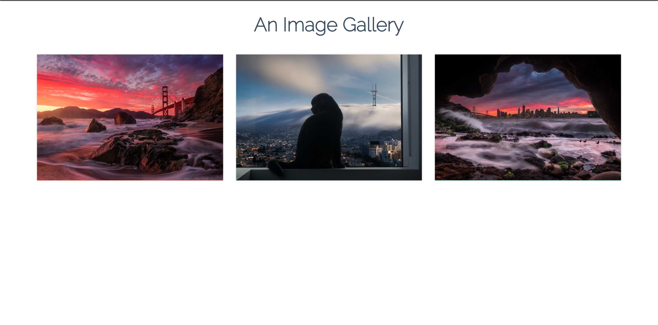
Needs some animated hover effects!
THE STRUCTURE
A background, the image, and an icon
KEYRAME
ANIMATIONS
Transitions allow us to animate a
single state change.
Keyframes allow for much more complex
multi-state animations
TRANSITIONS
Go from state A to state B
KEYFRAMES
Go from state A to state B to state C to state D to state E...
0%
100%
50%
25%
75%
color:red
HELLO!!
color:orange
color:yellow
color:green
color:blue
HELLO!!
HELLO!!
HELLO!!
HELLO!!
font-size: 40px
font-size: 20px
font-size: 20px
Keyframe Syntax
@keyframes rainbowtext {
  0%{
    color: red;
    font-size:20px;
  }
  25%{
    color:orange;
  }
  50%{
    color:yellow;
    font-size:40px;
  }
  75%{
    color:green;
  }
  100%{
    color: blue;
    font-size:20px;
  }
}
NAME IT
ADD AS MANY AS
YOU WANT
MUST START
WITH THIS
Step 1: Define
Keyframe Syntax
p {
  animation-name: rainbowtext;
  animation-duration: 3s;
  animation-timing-function: linear;
  animation-delay: 0s;
  animation-iteration-count: infinite;
}
MUST MATCH
NAME
Step 2: Apply
Keyframe Syntax
@keyframes rainbowtext {
  0%{
    color: red;
    font-size:20px;
  }
  25%{
    color:orange;
  }
  50%{
    color:yellow;
    font-size:40px;
  }
  75%{
    color:green;
  }
  100%{
    color: blue;
    font-size:20px;
  }
}
NAME IT
ADD AS MANY AS
YOU WANT
MUST START
WITH THIS
Let's take a look at some of the other "newer" animation properties
All the usual suspects are here...
- animation-name
- animation-duration
- animation-timing-function
- animation-delay
- animation-iteration-count
- animation-fill-mode
- animation-direction
- animation-play-state
animation-iteration-count
How many times should it repeat?
animation-iteration-count: 1;animation-iteration-count: infinite;animation-iteration-count: 7;animation-direction
Let's just look at an example, it'll be easier!
animation-direction: forward;animation-direction: reverse;animation-direction: alternate;animation-fill-mode
Specifies how an animation should apply styles before and after the animation
animation-fill-mode: forwards;animation-fill-mode: backwards;animation-fill-mode: both;animation-fill-mode: none;It makes more sense with an example, I promise
animation-play-state
Specifies whether the animation is running or paused
animation-play-state: paused;animation-play-state: running;YOUR
TURN
ANIMATED
SUN/SKY
EXERCISE
0%
100%
50%
25%
75%
THE SUN
0%
100%
30%
10%
90%
THE SKY COLOR
70%
Shorthand Animations
animation: 3s ease-in 1s 2 reverse both paused slidein;animation: jiggle 4s;animation: changecolor 3s linear 1s infinite alternate;CSS Animations
By Colt Steele


