CSS
FLEXBOX
Soooooo
WHAT IS FLEXBOX?
"It's a more efficient way to lay out, align and distribute space among items in a container"
even if their size is unknown
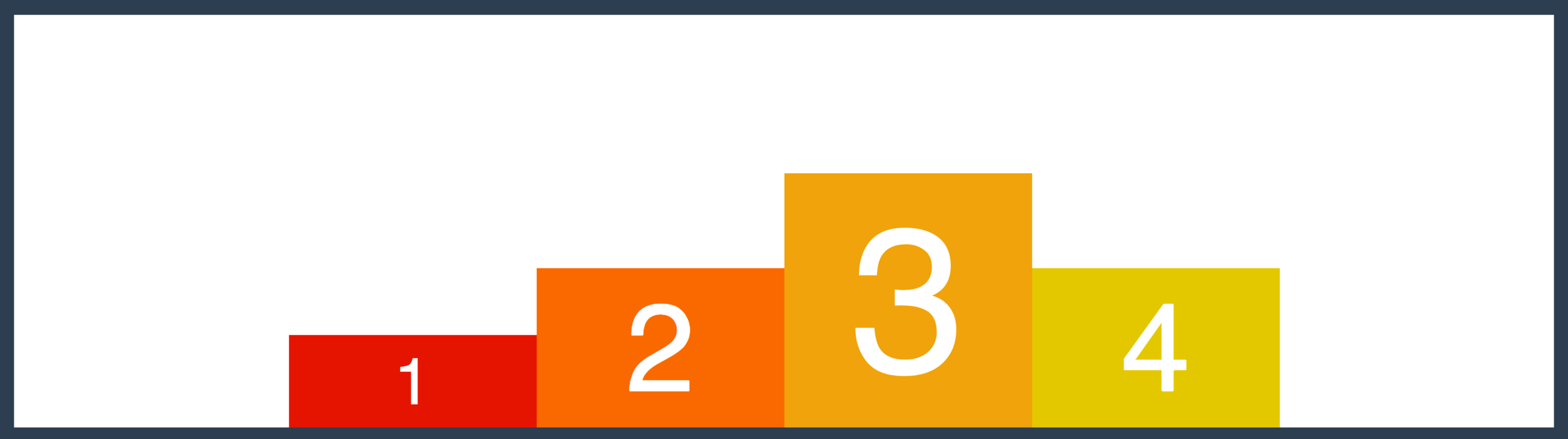
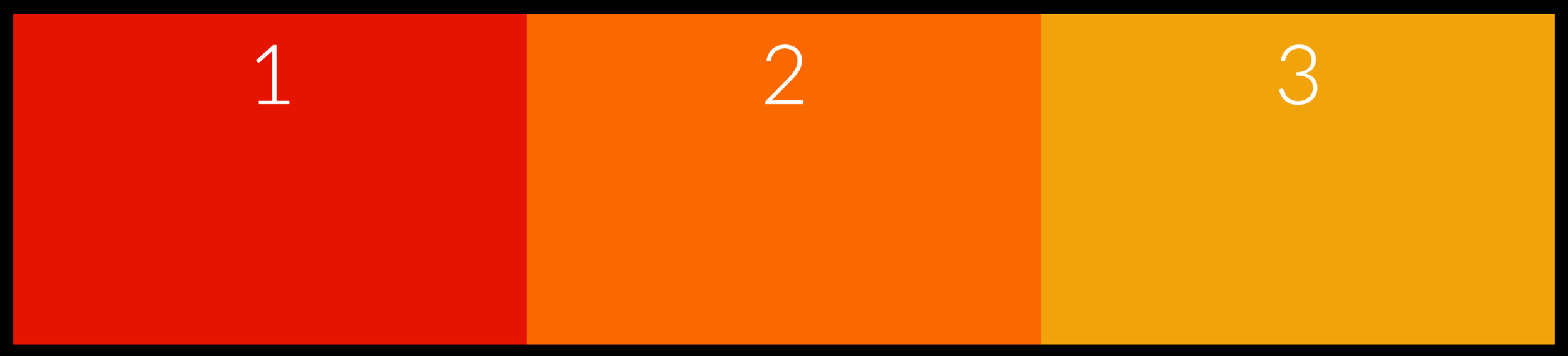
Imagine you have three items in a container...
This is one potential way to arrange them
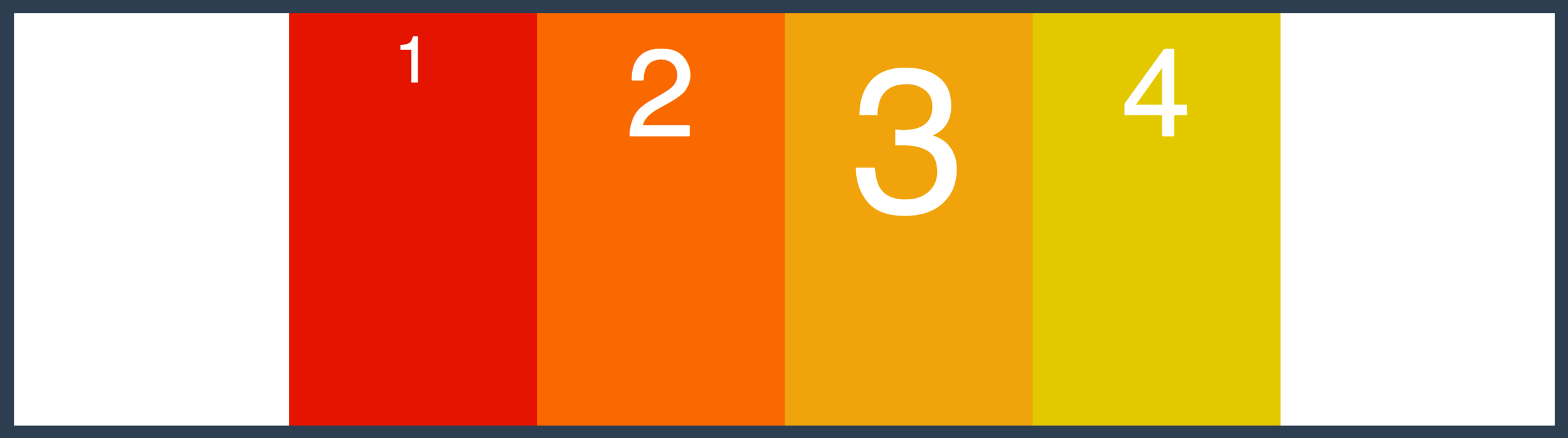
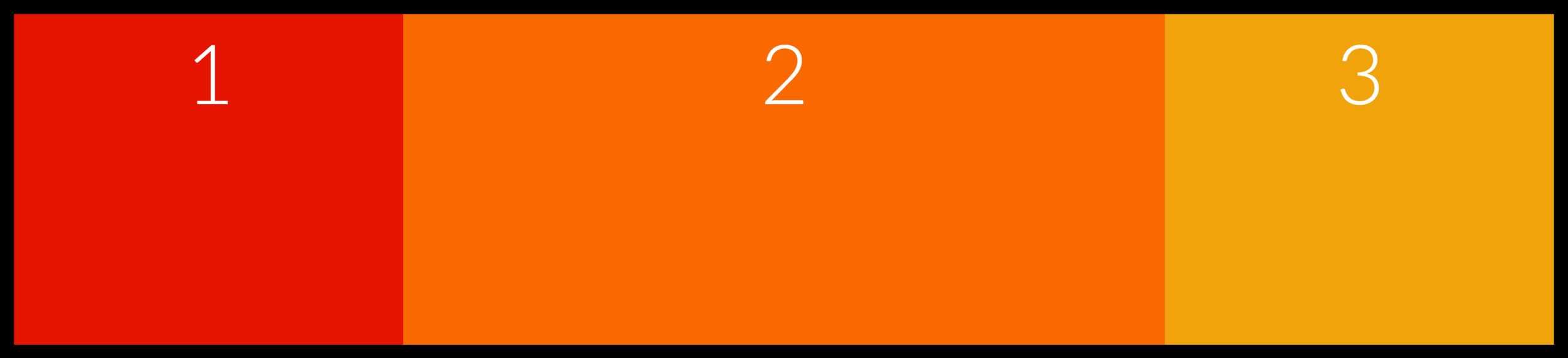
Here's another
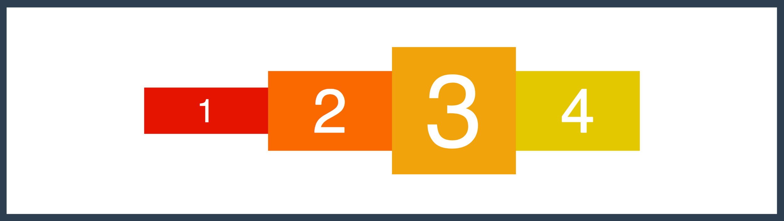
And another
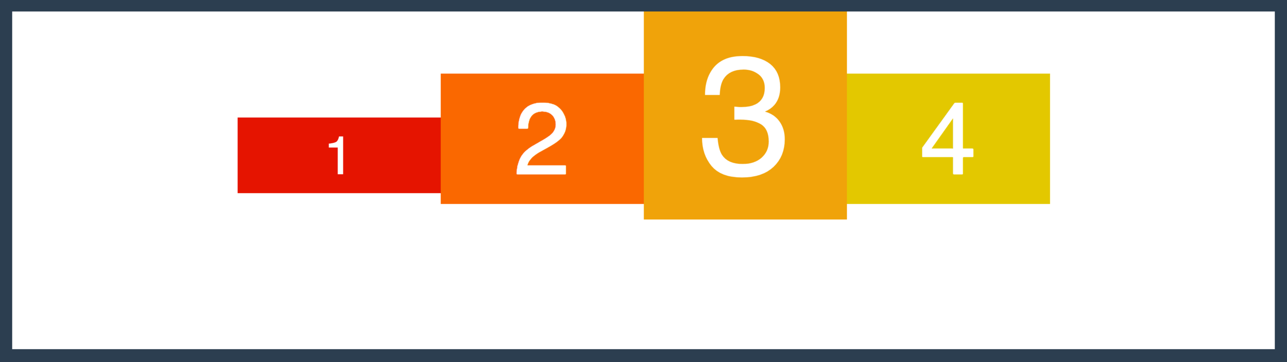
And another
And another
What About
Going Vertical?!
All of these layouts are easily achieved using FLEXBOX!
Container Properties
Flex Item Properties
flex-direction
flex-wrap
justify-content
align-items
order
flex
align-self
align-content
flex-grow
flex-shrink
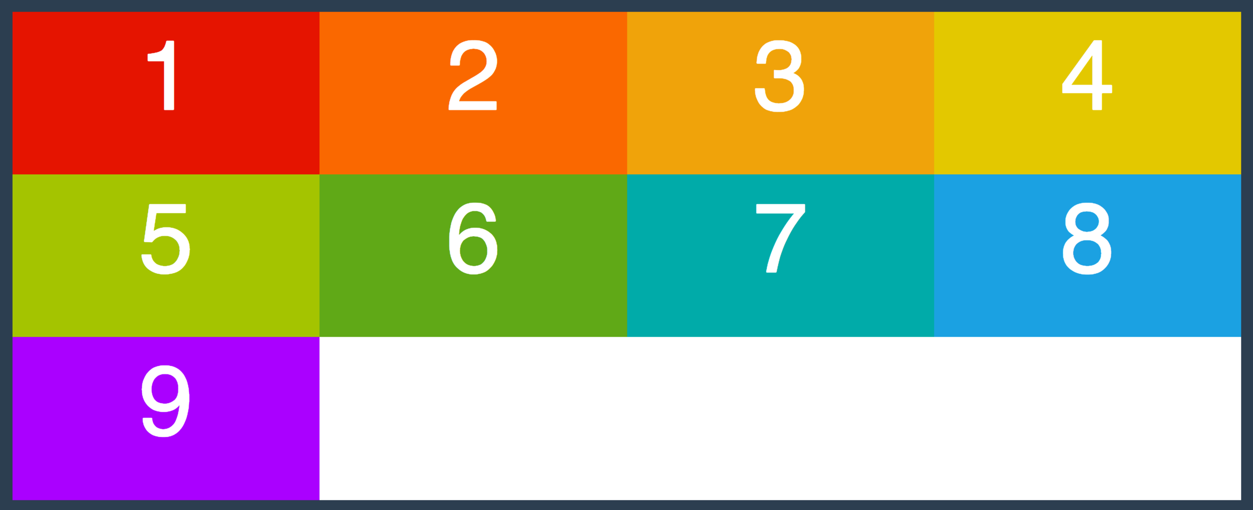
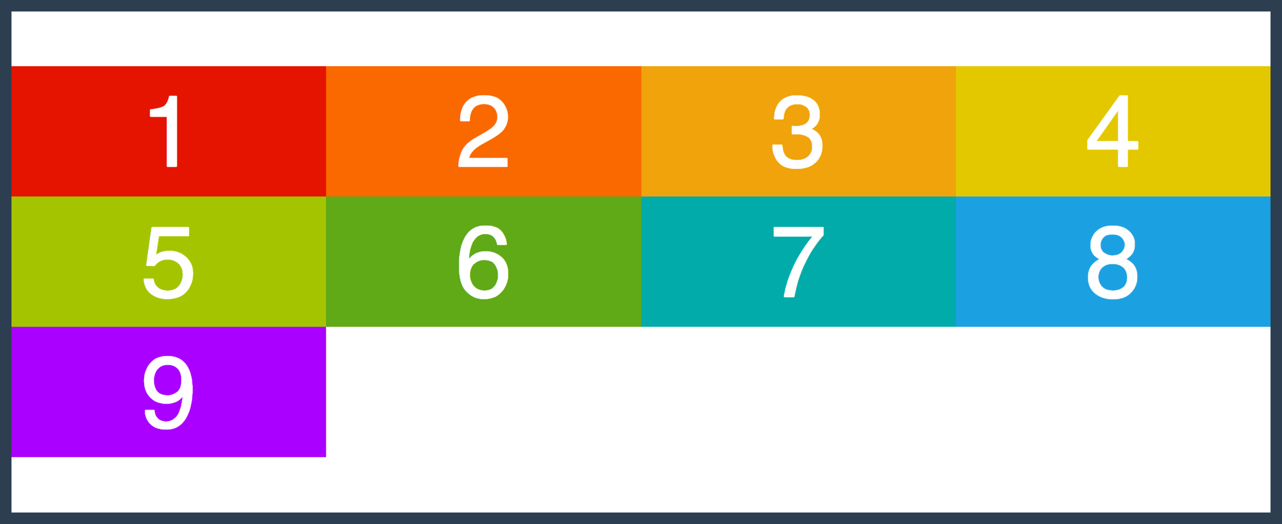
A STARTING POINT
Four DIV's Inside A Container DIV
FIRST BIT OF MAGIC
.container {
    display: flex;
}
SOME TERMINOLOGY
Main Axis
Cross Axis
flex container
flex item
flex item
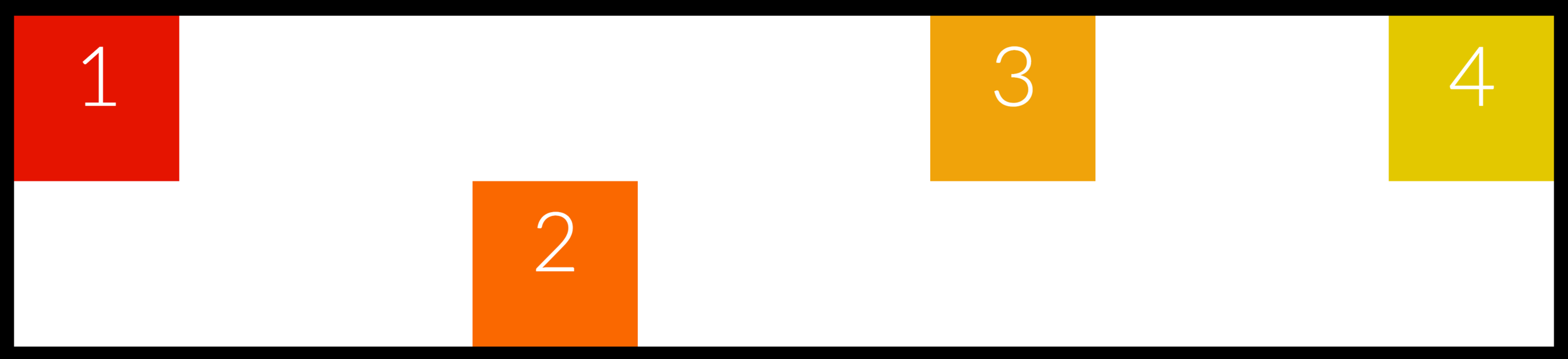
flex-direction
specifies how items are placed in the flex container, defining the main axis and its direction
flex-direction
Main Axis
Cross Axis
flex-direction: row;flex-direction
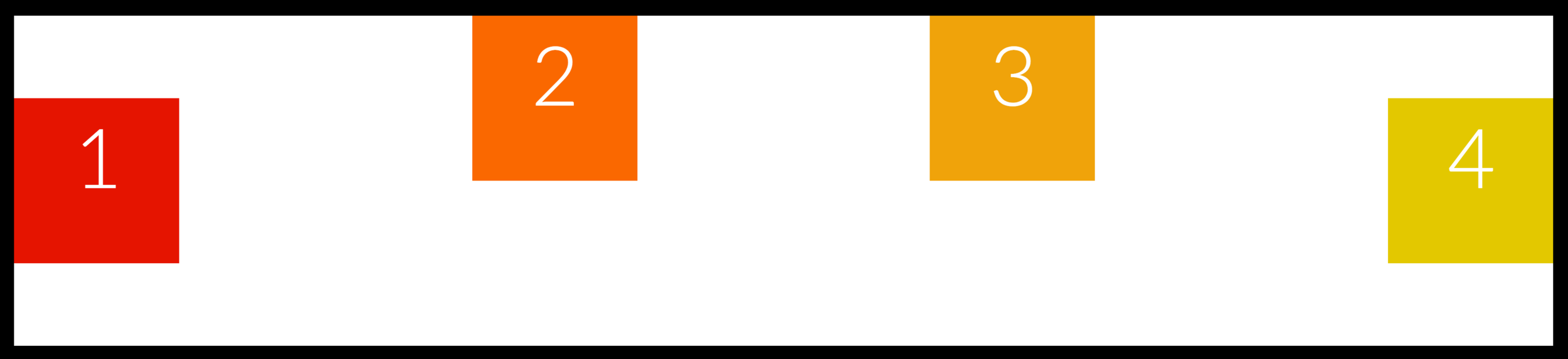
flex-direction: row-reverse;Main Axis
Cross Axis
flex-direction: row-reverse;flex-direction
flex-direction: row-reverse;Main Axis
Cross Axis
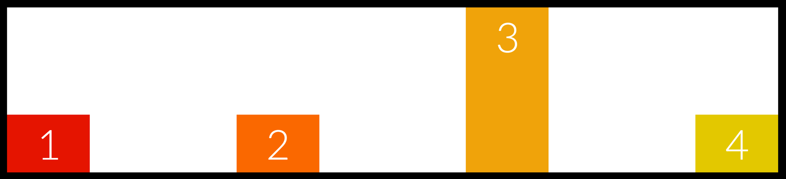
flex-direction: column;flex-direction
flex-direction: row-reverse;Main Axis
Cross Axis
flex-direction: column-reverse;flex-wrap
specifies whether items are forced into a single line OR can be wrapped into multiple lines
Let's make our boxes much larger
.box {
  width: 300px;
}
WHAT IS GOING ON?? THOSE AREN'T 300px!
Add flex-wrap to our flex container
.container {
  flex-wrap: wrap;
}
There we go!

wrap-reverse reverses the start/end of the cross axis
.container {
  flex-wrap: wrap-reverse;
}
Cross Axis
justify-content
Defines how space is distributed between items in flex container
Along the main axis
justify-content

.container {
  justify-content: flex-end;
}
justify-content

.container {
  justify-content: center;
}
justify-content
.container {
  justify-content: space-between;
}
justify-content

.container {
  justify-content: space-around;
}
YOUR
TURN
For a very tiny, non-scary exercise
Build A Flexbox Sidebar
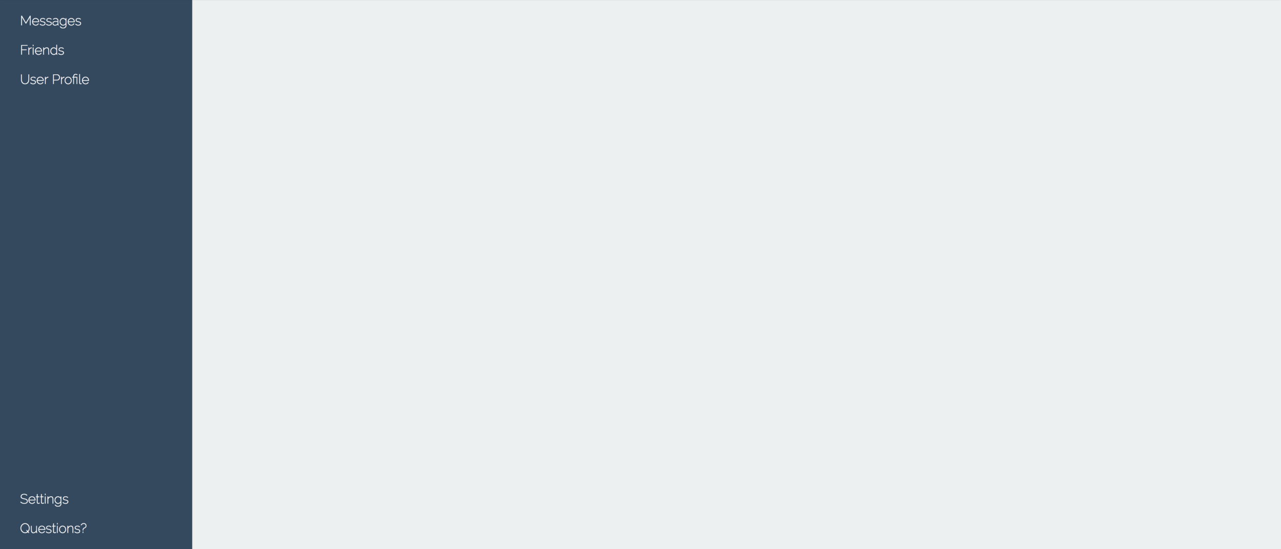
HINTS (if you want them)
align-items
Defines how space is distributed between items in flex container
Along the cross axis
align-items
.container {
  align-items: flex-start;
}
Cross Axis
align-items
.container {
  align-items: flex-end;
}
Cross Axis
align-items
.container {
  align-items: stretch;
}
Cross Axis
align-items
.container {
  align-items: center;
}
Cross Axis
align-items
.container {
  align-items: baseline;
}
Cross Axis
align-content
Defines how space is distributed BETWEEN ROWS in flex container
Along the cross axis
align-content
.container {
  align-content: stretch;
}
Cross
Axis
align-content
.container {
   align-content: flex-start;
}
Cross
Axis
align-content
.container {
   align-content: flex-end;
}
Cross
Axis
align-content
.container {
   align-content: space-between;
}
Cross
Axis
align-content

.container {
   align-content: space-around;
}
Cross
Axis
align-content
.container {
  align-content: center;
}
Cross
Axis
Let's Make A Navbar
Container Properties
Flex Item Properties
flex-direction
flex-wrap
justify-content
align-items
order
flex
align-self
align-content
flex-grow
flex-shrink
flex-basis
align-self
allows you to override align-items on individual flex items
align-self
.container {
  align-items: flex-start;
}

.box-2 {
  align-self: flex-end;
}
align-self
.container {
  align-items: center;
}

.box-2, .box-3 {
  align-self: flex-start;
}
align-self
.container {
align-items: flex-end;
}
.box-3 {
align-self: stretch;
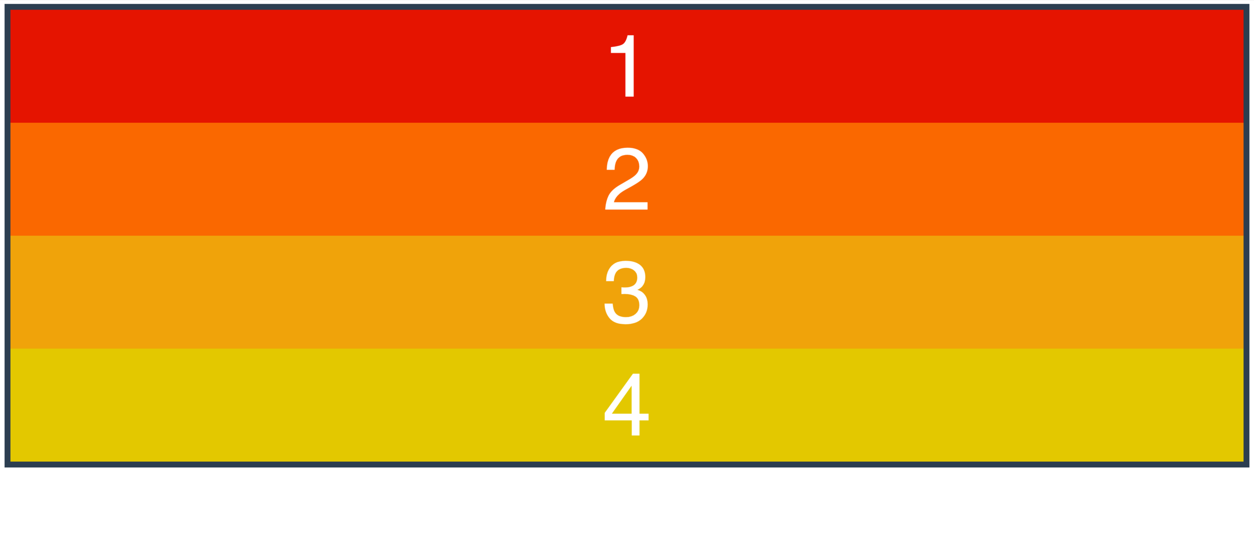
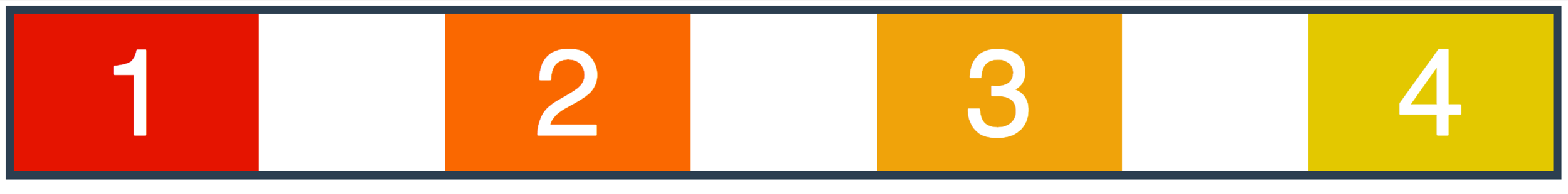
}order
specifies the order used to lay out items in their flex container
1
2
3
4
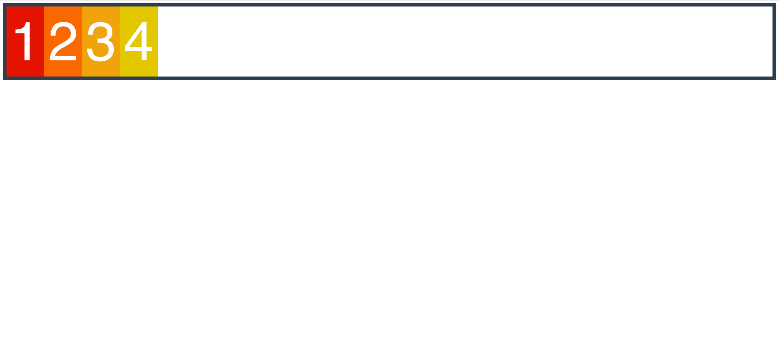
order
assign it to the individual items
1
2
3
4
.box-1 {
  order: 2
}
1
2
3
4
WHAT?!
😱
All items by default have an order of 0
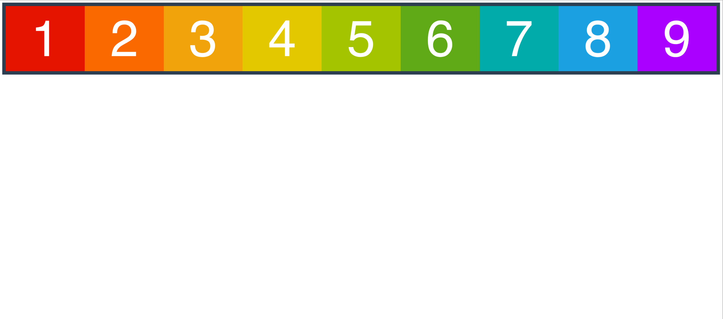
1
2
3
4
.box-3 {
  order: -1
}
1
2
3
4
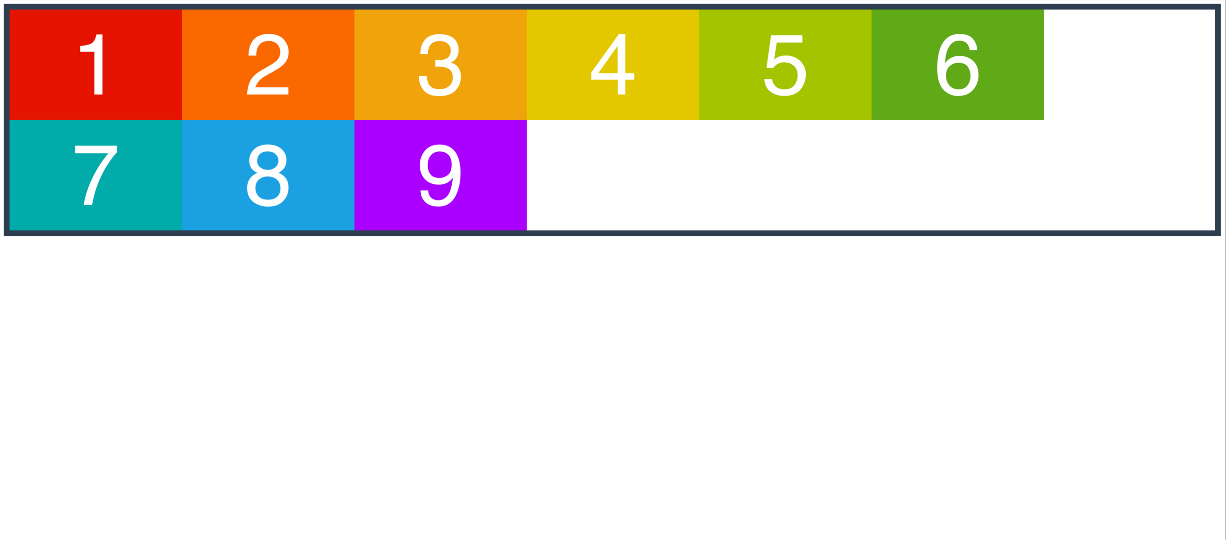
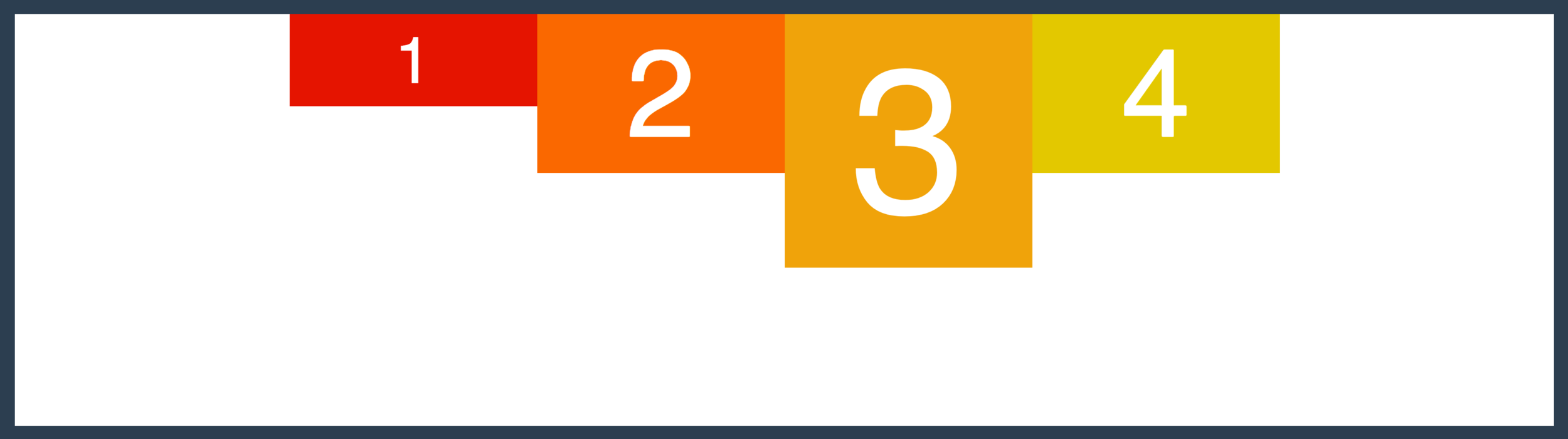
order
to make box-1 second in line...
1
2
3
4
.box-1 {order: 2;}
.box-2 {order: 1;}
.box-3, .box-4 {order: 3;}
So far, all of our items are equally sized
What if I want a layout like this?
flex
Defines how a flex item will grow or shrink to fit the available space in a container
(it's actually a shorthand property for 3 other properties)
flex:
<'flex-grow'>
<'flex-shrink'>
<'flex-basis'>
flex-basis
Sort of like width, but not.
Specifies the ideal size of a flex item BEFORE it's placed into a flex container.
flex-grow
Dictates how the unused space should be spread amongst flex items
It's all about ratios!
flex-grow
.box{
  flex-grow: 1;
}
To make all boxes share space evenly..
.box{
  flex-grow: 1;
}
.box-2{
  flex-grow: 2;
}
flex-grow
.box{
  flex-grow: 9;
}
.box-2{
  flex-grow: 18;
}
flex-grow
100px
100px
800px
1
2
box-1, box-2 {width: 100px}500px
500px
1
2
box-1, box-2 {
  width: 100px;
  flex-grow: 1;
}
260px
740px
1
2
box-1, box-2 {width: 100px};
box-1 {
  flex-grow: 1;
}
box-2 {
  flex-grow: 4;
}
Not 4 times as large!
flex-shrink
Dictates how items should shrink when there isn't enough space in contanier
flex:
<'flex-grow'>
<'flex-shrink'>
<'flex-basis'>
YOUR
TURN
The Holy Grail Layout
At least 800px
The Holy Grail Layout
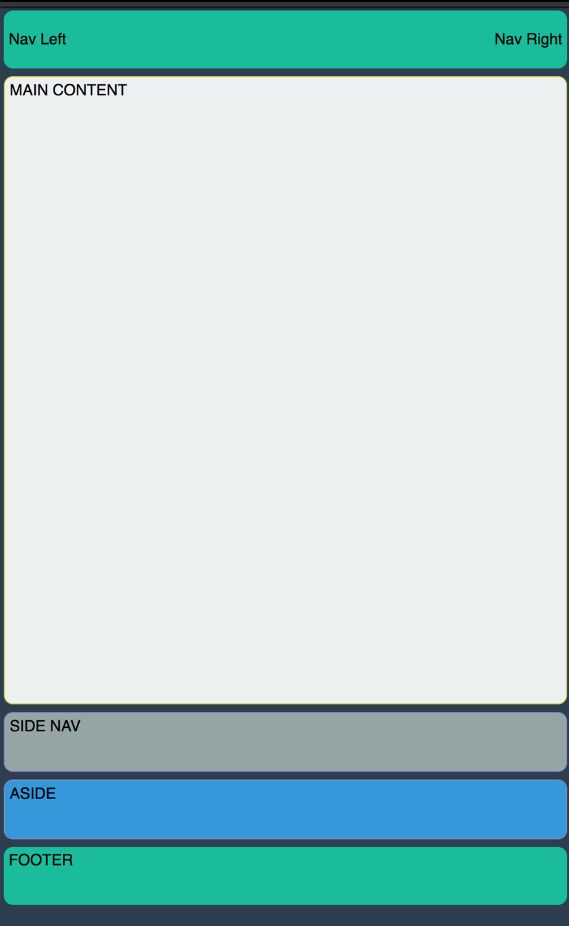
640px
breakpoint
A Note On
Browser Support
Flexbox
By Colt Steele


